Case Study: Kumoly Website UX Redesign & Rebranding
Project Overview
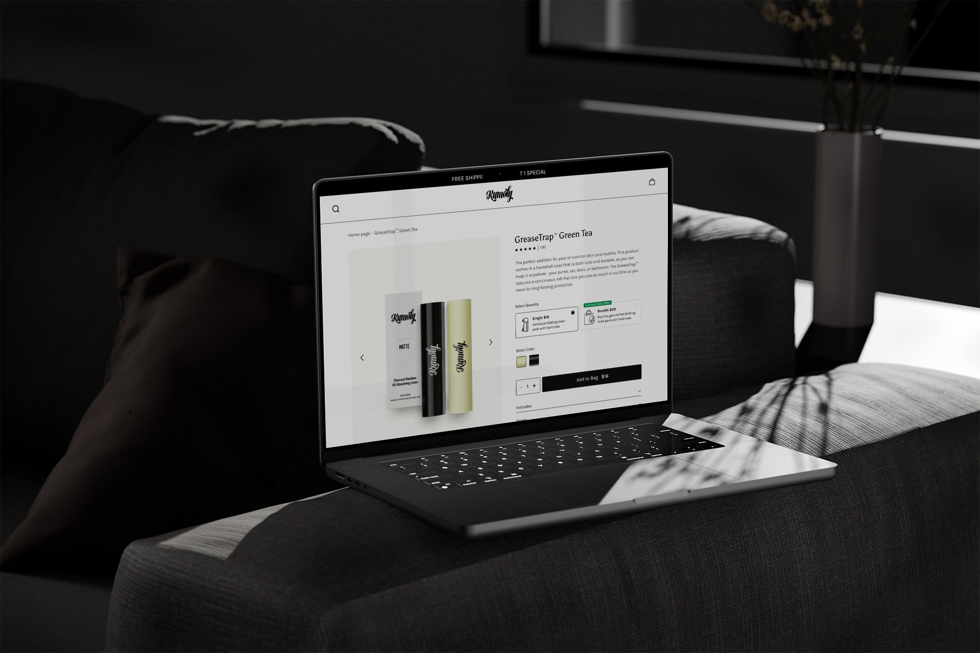
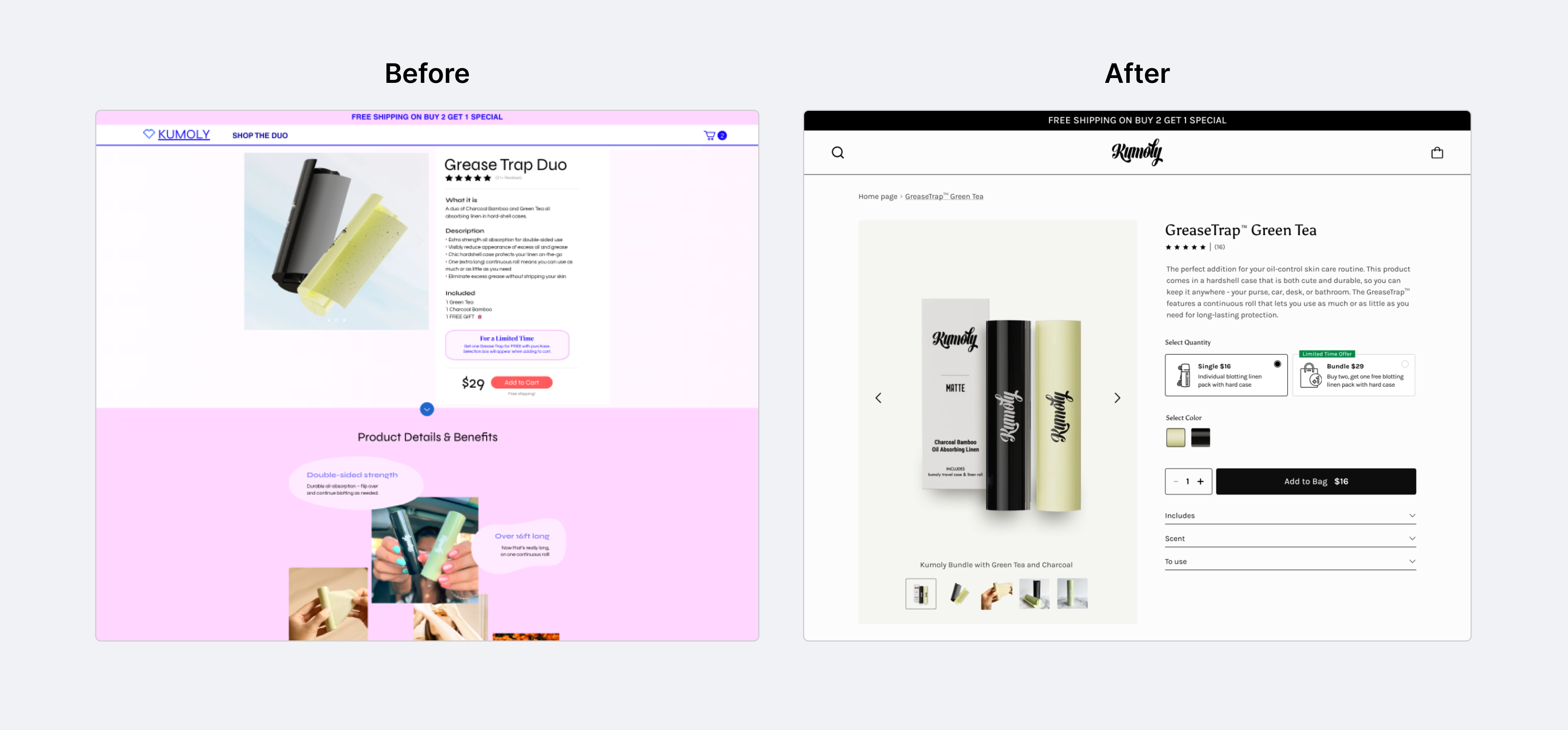
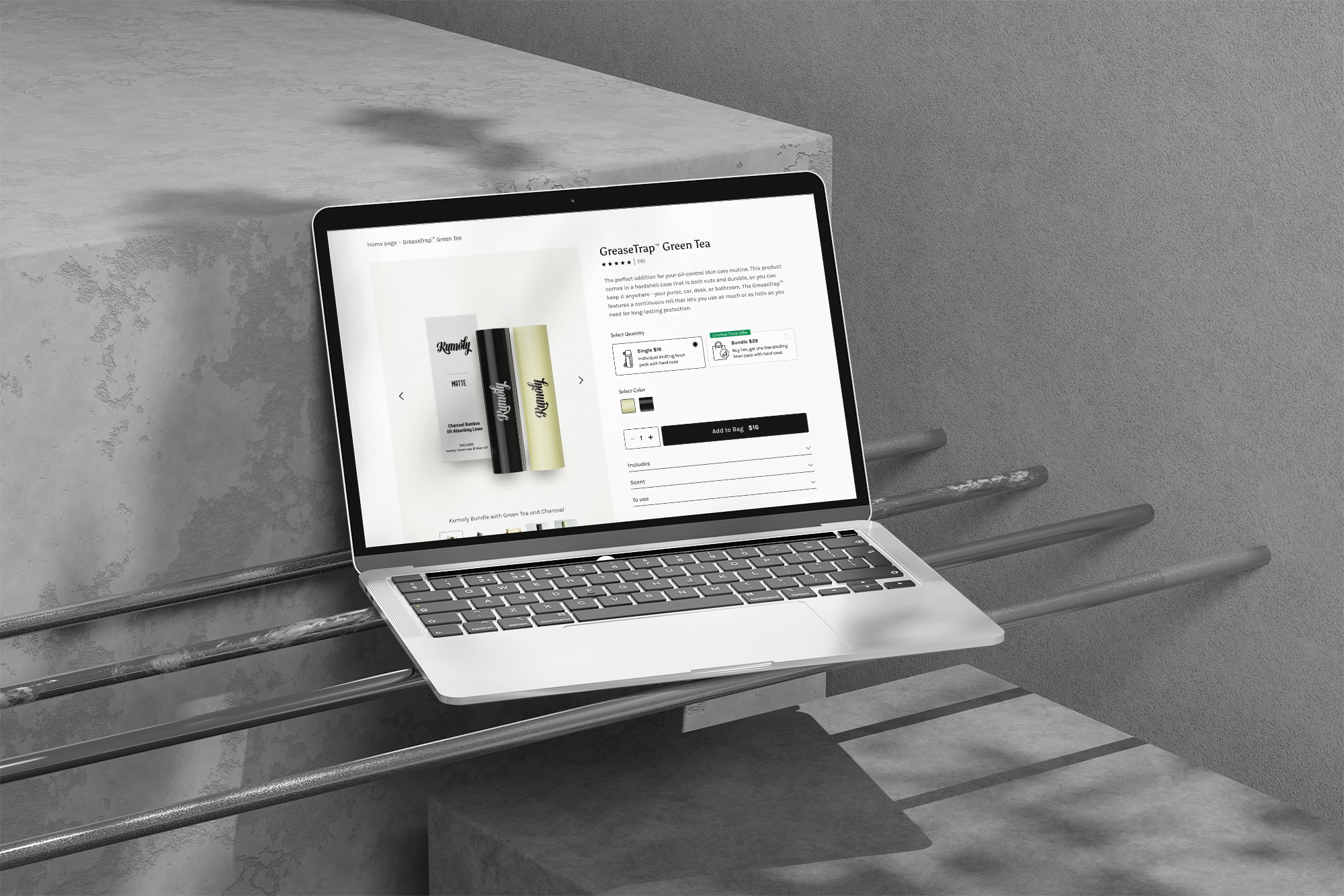
The objective was to improve the user experience of the Kumoly GreaseTrap™ Duo product page. The initial design presented usability challenges, including unclear product benefits, scattered information, and inconsistent visual hierarchy. My role involved conducting UX research, refining the product page layout, and ensuring a seamless and engaging shopping experience.
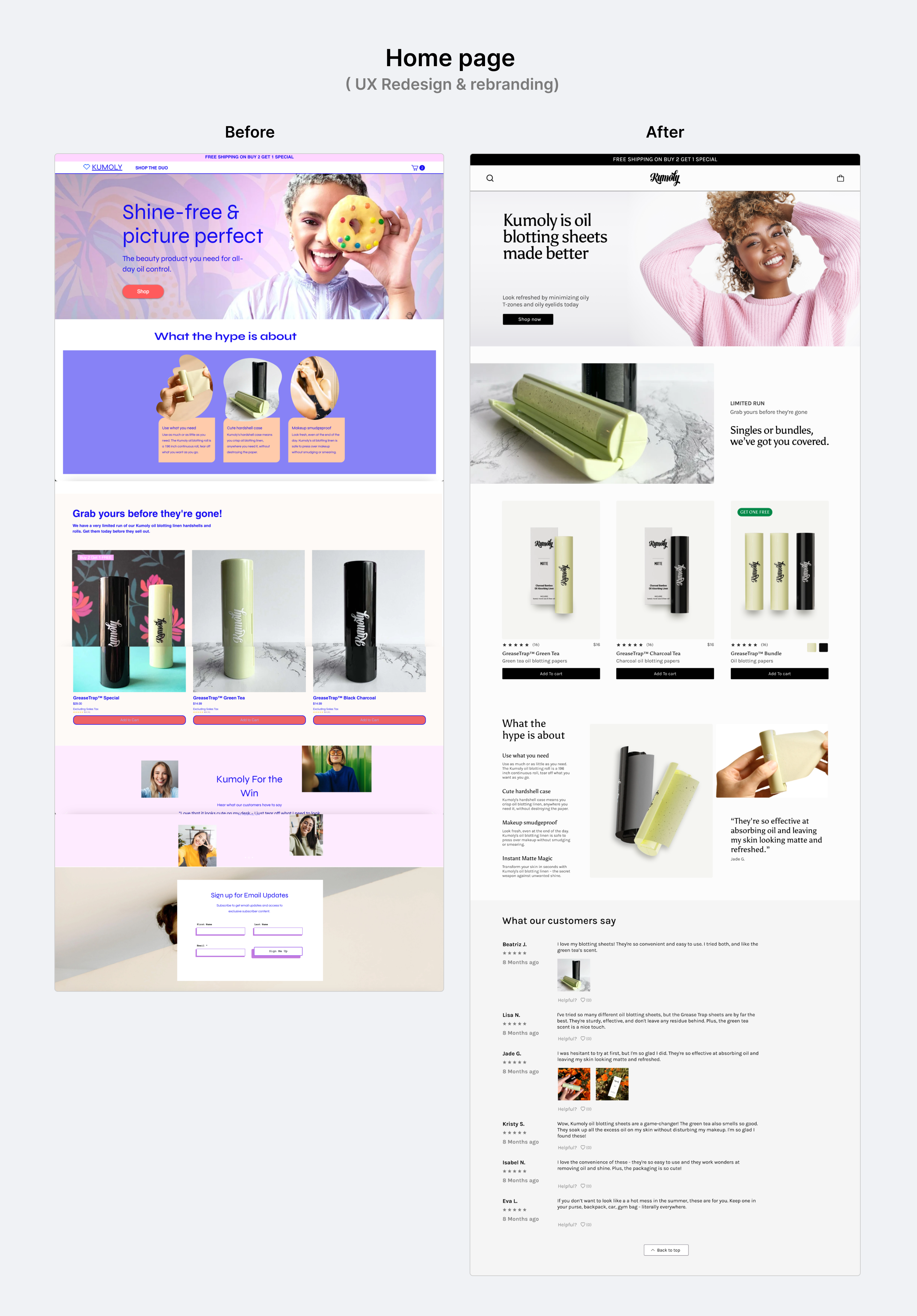
Challenges Identified in the Original Design
Cluttered Presentation:
- Key product details were hard to scan and buried under excessive text.
- Visual hierarchy was inconsistent, making it difficult for users to focus on call-to-action elements.
Limited Interactivity:
- Lack of dynamic visuals and engaging media to communicate product features.
Unclear Benefits:
- Users struggled to understand the unique selling points (e.g., double-sided strength, makeup safety).
Inefficient Conversion Flow:
- The "Add to Cart" button was less prominent and poorly integrated into the page structure.
UX Design Process
User Research & Insights
- Conducted usability testing on the original site to identify bottlenecks in the user journey.
- Gathered feedback from target users to understand their pain points and preferences.
- Used analytics tools to pinpoint high exit rates and areas of low engagement.
Problem Definition & Ideation
- Defined key design goals: improve usability, create clear product communication, and establish a strong brand identity.
- Ideated solutions through sketches and wireframes, focusing on a streamlined shopping flow and clearer visual hierarchy.
Prototyping & Visual Design
- Created high-fidelity prototypes with a modern aesthetic, emphasizing vibrant colors, bold typography, and consistent branding.
- Designed distinct sections to highlight product features, benefits, and customer testimonials.
Testing & Iteration
- Conducted A/B testing to compare the old and new designs, focusing on click-through rates and time-on-page metrics.
- Iterated based on user feedback, refining elements like button placement, typography, and calls to action.
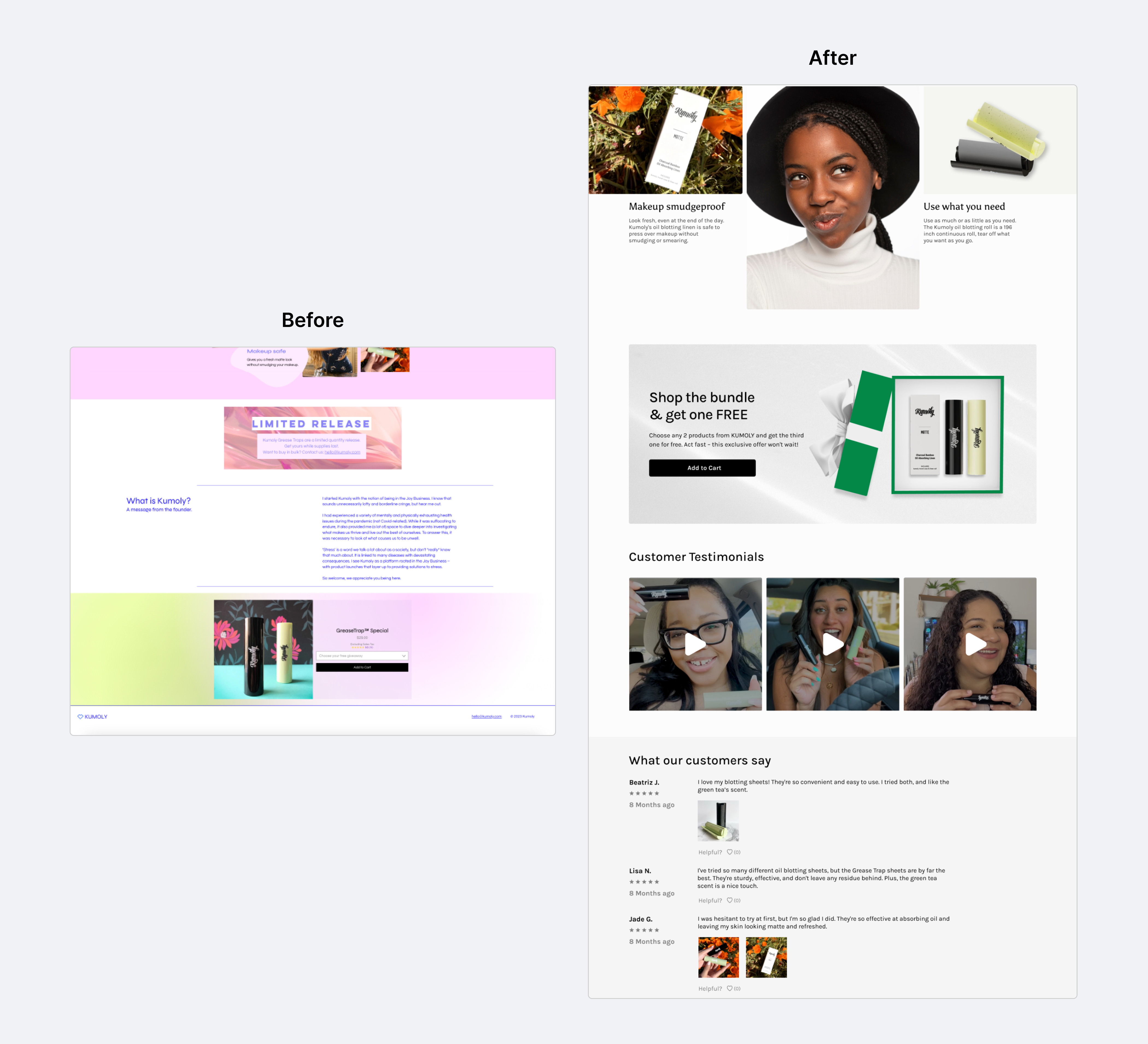
Key Improvements
Enhanced Product Communication
- Added concise, scannable product descriptions supported by visually engaging icons and images.
- Highlighted unique selling points like portability, makeup safety, and double-sided strength.
Improved Visual Hierarchy
- Structured the content into clear sections for benefits, testimonials, and purchase options.
- Incorporated contrasting colors and whitespace to guide user focus to key elements like CTAs.
Honest Video Testimonials
- Collected and integrated video feedback from real customers, showcasing authentic experiences with the product.
- Videos were placed strategically to build trust and engage users with relatable stories.
Streamlined Purchase Flow
- Simplified the shopping experience with a prominent “Add to Cart” button and reduced clicks to checkout.
- Emphasized urgency with a “Limited Release” banner to drive conversions.
Rebranding for Consistency
- Developed a fresh, cohesive visual identity that reflects Kumoly’s playful yet professional tone.
- Unified typography, color palette, and layout for a polished, on-brand experience.
Impact
Bounce Rate:
Reduced by 35%, indicating improved user engagement.
Conversion Rate:
Increased by 27% due to a more intuitive shopping flow and trust-building elements.
Time on Page:
Users spent 22% more time on the product page, exploring features and testimonials.
User Feedback:
Users appreciated the clean, modern design and found the video testimonials particularly compelling.