Paw Coach: user-centered landing page for pet care services
UX/UI design
UX Design Process
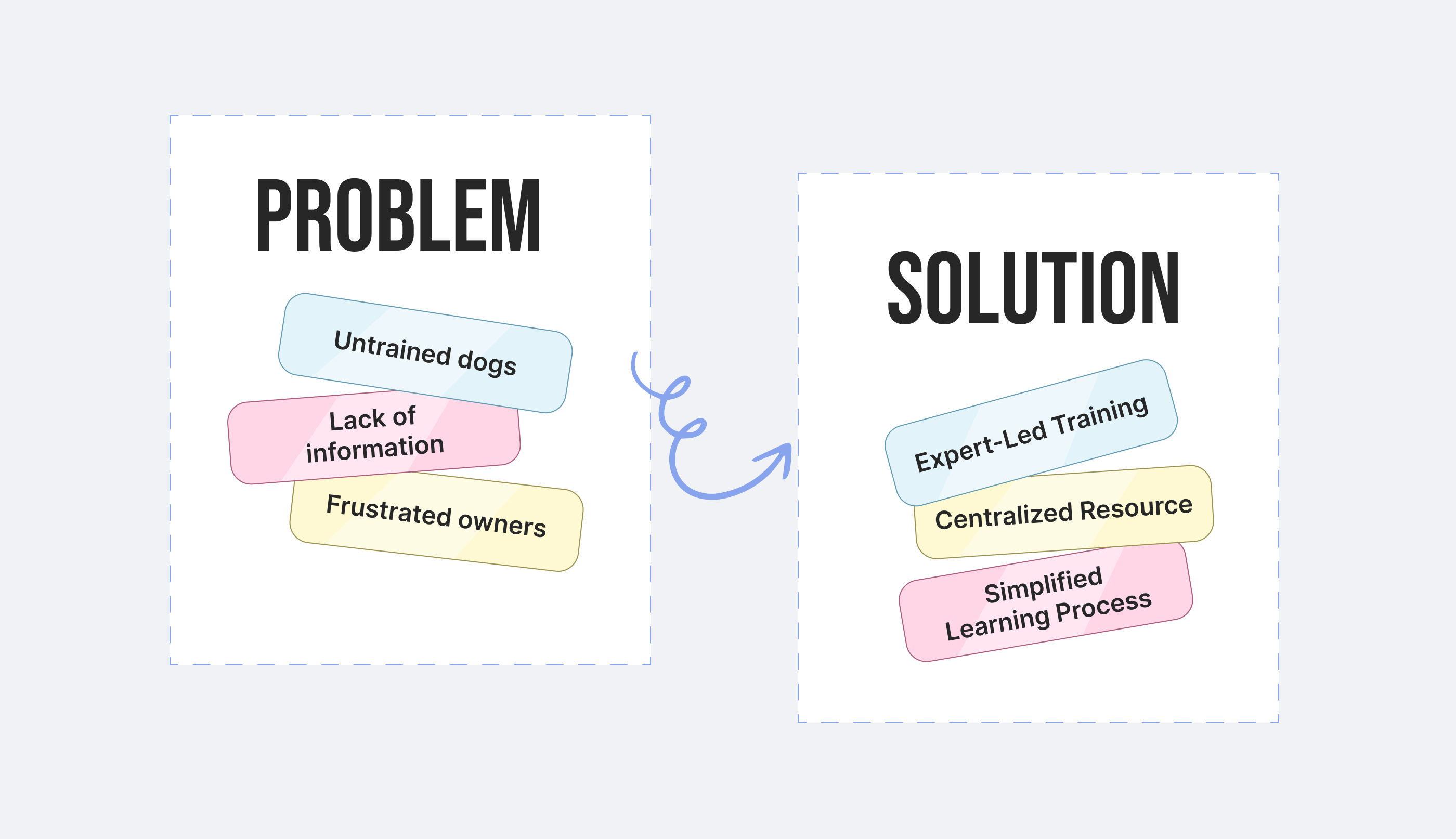
- User research:
- Conducted competitive benchmarking to understand industry standards.
- Defined key user personas, focusing on their journey and decision-making process.
- Information architecture (IA):
- Developed a clear content hierarchy to address user needs efficiently.
- Used visual weight and proximity principles to group related information (e.g., services, testimonials).
- Ensured all critical CTAs (calls-to-action) are visible and accessible without overwhelming the user.
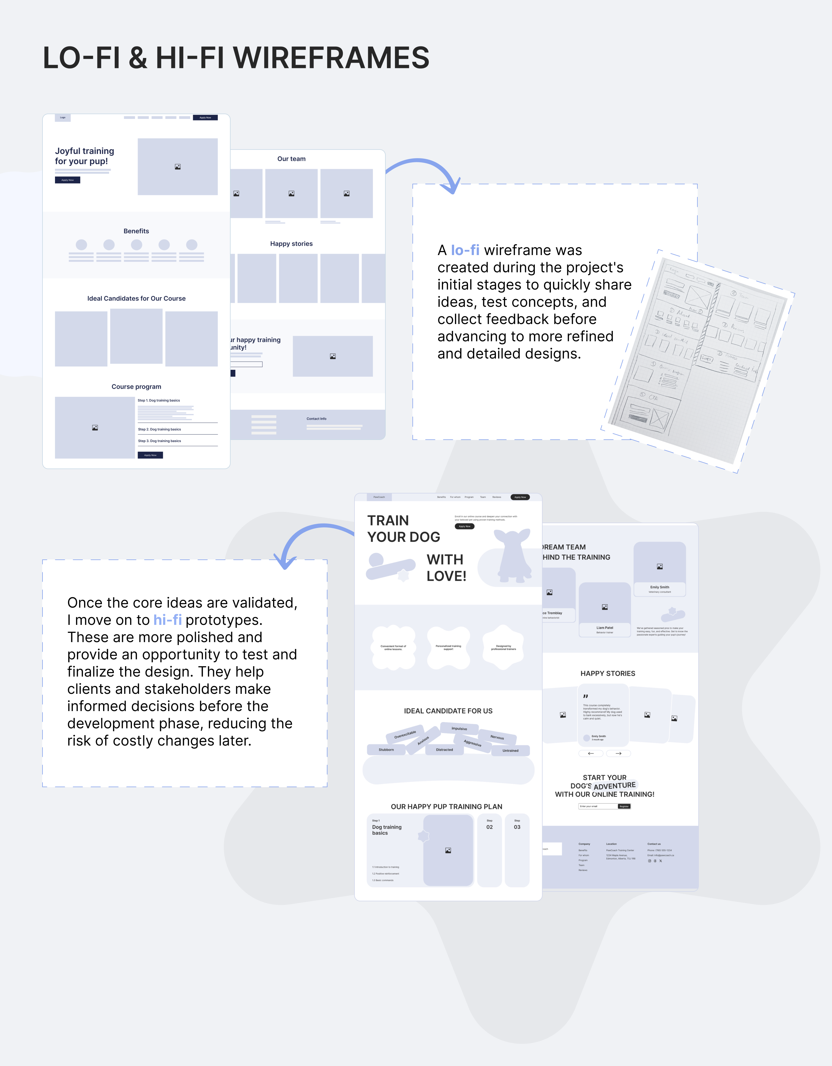
- Wireframes and prototyping:
- Created low-fidelity wireframes to test different layouts for usability.
- Focused on smooth scrolling, logical content flow, and reducing cognitive load.
- Interactive prototypes were tested to refine transitions and CTA placements.
- Visual and interaction design:
- Designed micro-interactions (e.g., hover effects, animated transitions) to create a sense of engagement and responsiveness.
- Used pet-friendly visuals and soft colors to establish an emotional connection.
- Balanced decorative and functional elements, ensuring aesthetics never compromised usability.
- Usability testing:
- Conducted usability tests with real pet owners to identify friction points in navigation or interaction.
- Iterated on feedback to improve ease of use, especially for the mobile-first design.
Key UX Features
- Hero section:
- Simple, emotionally compelling headline with a clear CTA button ("Get Started").
- An engaging visual of happy pets immediately connects with users emotionally.
- Service cards:
- Highlighted core services using icons and concise text for scannability.
- Secondary CTAs within each section direct users to detailed information without disrupting their flow.
- Testimonials and social proof:
- Positioned strategically after the service overview to reinforce trust before the user commits to action.
- Progressive disclosure:
- Simplified initial content with "Read More" links, allowing users to dive deeper only if needed.
- Mobile optimization:
- Designed with a mobile-first approach, ensuring touch-friendly interactions and fast-loading visuals.
What Makes This Project Successful
From a UX Perspective:
- User-сentered design:
- Extensive research identified user pain points and tailored the page to address them (e.g., clear CTAs, easy navigation, emotional appeal).
- User personas were created to understand and prioritize the needs of pet owners.
- Logical information architecture (IA):
- The content flow was designed to match the user journey, from learning about the service to taking action.
- Sections are arranged in a natural hierarchy, ensuring users can quickly locate relevant information.
- Intuitive navigation:
- Simplified navigation with minimal cognitive load.
- Progressive disclosure ensures users are not overwhelmed, with options to explore more if needed.
- Accessibility:
- Ensured the landing page is inclusive, with features like screen-reader compatibility, keyboard navigation, and clear button labels.
- Contrast ratios and legibility were prioritized for users with visual impairments.
- Conversion-focused design:
- Strategically placed CTAs guide users toward key actions (e.g., signing up, booking a session).
- Testimonials and social proof reduce decision anxiety and build trust.
- Mobile-first approach:
- The design was created with mobile users in mind, ensuring touch-friendly interactions and fast-loading visuals.
- Emotional connection:
- Visual and textual elements were designed to resonate emotionally with pet owners, fostering trust and relatability.
From a UI Perspective:
- Strong visual hierarchy:
- Key elements like CTAs and headlines are visually prominent, using size, color, and placement to draw attention.
- Content blocks are organized for scannability, with clear headings and consistent spacing.
- Brand identity alignment:
- The color palette, typography, and imagery reflect the friendly and caring nature of the Paw Coach brand.
- Consistency in style reinforces the brand’s professionalism and trustworthiness.
- Aesthetics and engagement:
- Soft, warm tones and playful illustrations evoke comfort and approachability.
- Micro-interactions, such as hover effects and animations, enhance the user experience without overwhelming the content.
- Typography and readability:
- A clean, modern font pairing ensures all text is legible across devices.
- Hierarchical font sizes and weights improve readability and support content flow.
- Responsive design excellence:
- Visual elements scale effectively for different devices, ensuring usability and aesthetic appeal on mobile, tablet, and desktop.
- Buttons, images, and text maintain clarity and functionality on smaller screens.
- Attention to detail:
- Pixel-perfect alignment, consistent padding, and balanced whitespace create a polished and professional design.
- Interactive elements are visually distinct and encourage user interaction.
- Visual feedback:
- Interactive cues, like button hover states and loading animations, provide reassurance and improve interactivity.